V&A mused
I was asked to design a website focussed primarily at 10-14 year olds, (Gen A), for V&A who felt strongly that they needed to connect with this audience and introduce them to their entertaining and rich content. I had already worked on many complicated builds before and with young people for Tate Kids and NHS Digital.
Work
- Art direction
- Design discovery
- User research & user labs
- Service design
- Information architecture
- Interface design
- UX design
- Provenance
- Marketing design
About the project
The V&A successfully bid and were supported by Bloomberg Philanthropies which allowed for a thorough examination of how the V&A might engage young people in art, design, fashion, music, gaming and general creativity via the medium of quizzes and challenges.
The project was to be a very user-focussed quiz site with a heavy emphasis on introducing young people to the V&A in a fun and non-cynical way through subtle learning opportunities with a smattering of design mischief. It needed to be fun, informative, stylish, mature, reflect V&A aesthetic but very much have a life of it's own.
The site was independent of the opening of Young V&A and V&A East but would launch around the same time as the former. This gave us the best part of 9 months.
The core team on this project were contractors working closely with the in-house V&A Digital. This included Eva Liparova as Project Manager and James Nation as Product Owner, Kati Price, Head of Digital Media and Publishing at the V&A, as well as Tom Shreeve, Erica McKoy, Megan Graye on content delivery and Kim Plowright on interim Project Management. Big Bite were the 3rd party development team.
Discovery
We were lucky enough to have the time, budget and stakeholder confidence to allow us to carry out a comprehensive discovery phase. In my experience, this is such a fundamental necessity and when skipped can lead to all sorts of sticky issues further down the line.
In order to tackle this project successfully we had to agree and define what the primary challenges were, not just for the stakeholders but ultimately the service users. We needed to be extremely forensic about how we were going to tackle this and pass on detailed instructions to the development team. We had a pitch and a brief and this is where we started.
User research is a non-negotiable for any project. Wider digital teams and stakeholders can naturally be keen to devise creative solutions at an early stage sometimes without asking potential users what they need. Testing needs to be carried out with as wide a variety of people as possible. Demographically, geographically, culturally, with varied digital literacies and access and different from the team and the client even when the project is aiming to attract a specific cohort. And this is exactly what we did.
Problem statements
To avoid immediately jumping to assumptions and solutions and to plan the work effectively, we defined a clear set of over-arching problem statements, a discipline I'd gained working at NHS Digital, which meant that we could manage expectations, timelines, hypotheses and carve out some time for thorough design thinking.
By writing problem statements we could have candid conversations, we had a framework and the start of service manual and provenance around the project processes and spend.
It's important to be brutally honest at the beginning of this process. Initially, these statements would be things that we knew didn't know or understand such as:
- "We don’t yet know the exact intended audience for this specific V&A product"
- "We don't yet have a comprehensive idea of all the topics that young people are into or their online behaviours."
- "We don't know what all the features are" and the age-old classic, "We don’t yet know what success looks like"
We don't yet have a comprehensive idea of all the topics that young people are into or their online behaviours.
At later stages, once we'd executed several rounds of user testing, new problem statements became more about specifics, like:
- "Users were nervous about where their data might go. Their data protections are not expressed clearly enough"
- "The tone of this content is a bit confusing, users aren't sure what this message means"
- "Visitors don’t utilise the top area of the homepage very well"
We added new problem statements as we went along helping us to define the work which supported our agile project management.
User lab #1
We performed several rounds of user testing. During discovery we wanted to know more about our potential users and their behaviours. We knew by this time that we would be designing quizzes and challenges and we wanted to see how young people would behave, what their emotional response was to existing online quizzes. We also wanted to know what sort of content they share with friends and how much time they spend online. We observed and recorded what they did and what they said.
We engaged 12 x 10-14 year olds from varied economic and geographical backgrounds and digital literacies, interviewing them about their favourite online activities then asked them to perform a couple of tasks. First we asked them to complete a buzzfeed quiz and then second, much to their parents' chagrin, customising some Tony's Chocoloney chocolate.
We'd identified from our problem statements and subsequent hypotheses that we needed to understand user mechanics at play, emotional attraction to quizzes, why they might continue and do more, if they considered them educational or entertainment or both and if they felt customised content was important and/or fun.
Service design and information architecture
Early on, it was necessary to define the design parameters of the project by outlining the information architecture and service design the front-of-house and back-of-house user journeys and scenarios.
User lab #2
We were aiming to discover more structural answers at this point in the process. We asked a smaller set of the same testers to perform some card sorting so that we could understand what they understood about the canons: art, design, fashion, gaming etc as well as what other interests they had that we hadn't thought about.
Each participant had a set of pre-written titles on Miro cards and we asked them to group them as they saw fit and name each grouping. A lot of these were obviously a fashion topic or a gaming title but once they arranged them we soon saw other patterns emerge, there were potential future canons such as sport and cookery.
Information architecture
From the user research we were able to devise a map of the proposed structure of the site. What the hierarchy might be and in conjunction with the wider team, developed something that could be passed to the developers to work with.
We now knew the canons, we knew the desired content types and from there I could work out what were fixed taxonomies, and if there were slow-moving categories and fast-moving topics.
It was decided that most content for the site would be of a fast-moving less-hierarchical nature (Seasons, Pop stars, Games, Music: Pokemon, Beyonce, Manga, K-POP, Kendrick Lamar, Easter, Nike, Chappell Roan etc) but that all of them would need to belong to a canon (Fashion, Music, Gaming, Design, Films & shows, Random) and a content type (Trivia, Challenge or Personality quizzes, a Top 10 lists or pre-existing V&A factual content that we could repurpose). Now that we had defined that I could start the UX/UI process.
-
IA mapping for V&A mused -
IA mapping for V&A mused
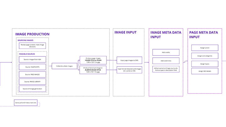
Service design
We knew the likely size of the V&A handover team. So I could map scenarios and we could workout where there may be pressure points in the production process. Given the importance of the look and feel, we identified a potential overhead in producing the quizzes and in particular sourcing images, making the promos, recording the meta data, copyright, general provenance and maintenance of the image database.
Going through this process was a deciding factor in the design direction. New problem statements emerged and so new hypotheses were proffered. How might a small content team produce the distinct style? How might I marry aesthetic V&A sensibilities with practical production requirements? How might I build image templates to hand over to the team?
How might I marry aesthetic V&A sensibilities with practical production requirements?
-
Service map for V&A mused -
Detail of the V&A mused service map
Look and feel
There was a unique design challenge. Like all institutions, there are rules about how you must treat and respect the brand. There are masterbrand absolutes which must be adhered to such as typography logos and structures. However, this specific project would sit outside the main V&A family of sites. It wasn't geographically located and it was also funded differently so understanding 'how much V&A' to inject into the design was going to take some experimentation.
Already in existence were the V&A funding pitch and accompanying pitch designs by the talented Jack Craig. There was a clear understanding that this website was to "age up" Gen A rather than appeal to the younger end of that demographic and the position on the landscape in which this site would sit and what missing service it aimed to provide.
We also had a trendspotters panel provided by Oxy Insights with a cohort of slightly older teenagers who could inform us each month what they were doing, thinking about and looking at so we could be more attune to their interests.
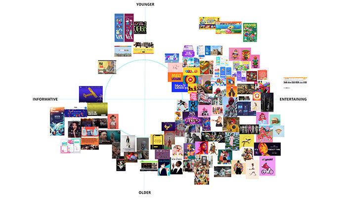
Mapping the landscape
I started by spending time travelling down tremendously enjoyable rabbit holes to immerse myself into the minds of 14 year olds. For once, I could legitimately spend time on TikTok and Instagram searching for viral trends, looking at Minecraft, Roblox, Lego, watching TV and online shows aimed at teenagers plus think about what we'd already asked in User Lab #1 and the first few Trendspotter reports.
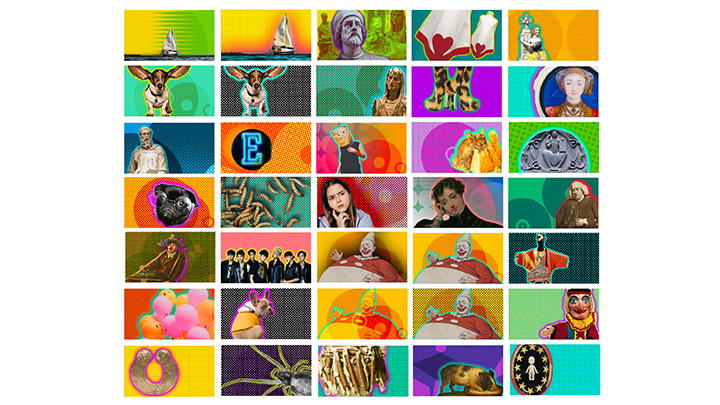
I mapped out aesthetics on a Younger vs Older Y axis and a Entertainment vs Educational X axis. I visited many illustration agency sites looking for current trends and trawled through other museum and art sites looking for content aimed at this age range. This mapping helped find aesthetic patterns.
I knew this site would firmly sit in the entertaining and slightly older part of the chart. I noticed that this area on the mapping had a lot of bright colours and vector graphics. The more mature; the less rounded or 3-dimensional. The more entertaining; the brighter the colours. I had a fundamental idea for what might appeal to young people. Now to marry the business and aesthetic needs of the V&A with this inspiration.
-
Mapping the landscape and placing the site design aspirations towards the bottom right. -
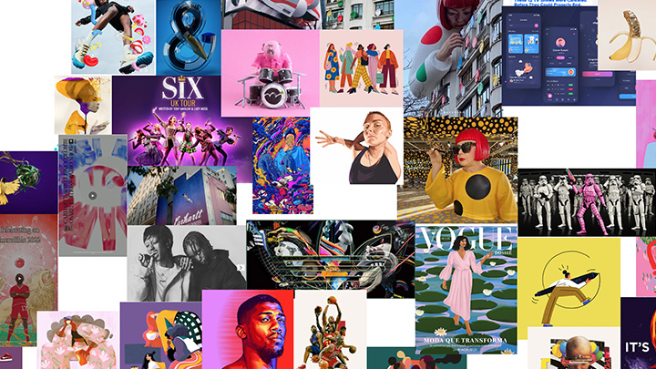
Detail of the bootm right area of the V&A mused landscape mapping
V&A content treatment
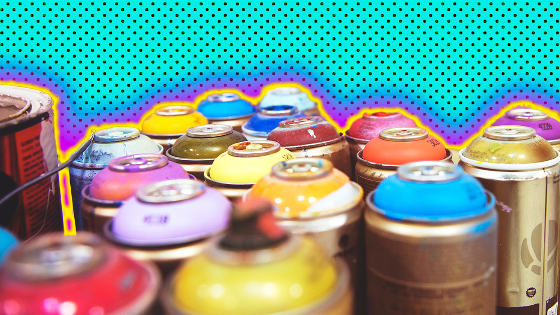
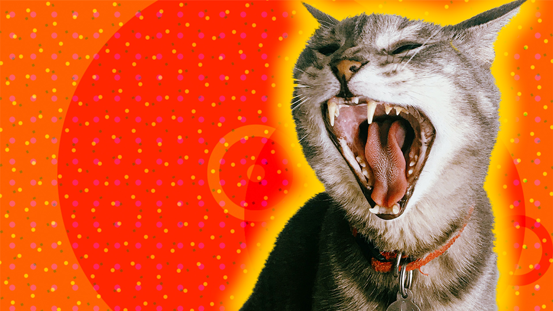
It was at the point that Kati said, "Think about the content expression first" that things started to click. I rethought my design strategy. There were a few items that I'd watched and seen that suddenly came to mind along with the nature of craft found in the V&A museums. I started to lean into collage, layers, the textures of Riso prints, dot matrices, half tones. Two specific things had stuck out from my research: the textures from the end credits for the Disney TV series Extraordinary and just about every colour in just about every post from Nobody Sausage on TikTok and Instagram.
-
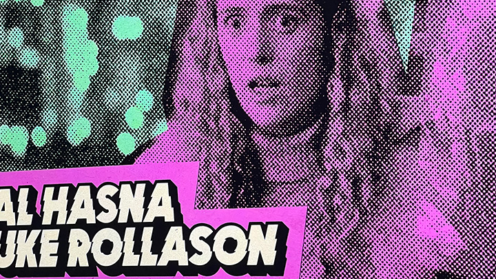
Extraordinary end credits -
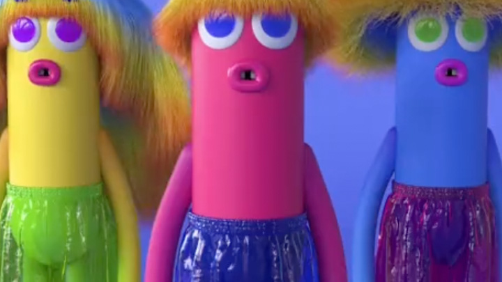
Nobody sausage is colour wonderment
What do users want? How far can I push the design?
I thought in a similar way as I had on the Tate Kids project; what would I design if I was a 14 year old and had been let loose with Photoshop? And so a sudden explosion of colour and texture ensued. What could I do with some basic Photoshop shapes and filters? How could I manipulate those in a fun unconventional way? How might I mix those shapes and textures with: items from the V&A collections, from library images, from AI generated images?
What would I design if I was a 14 year old and had been let loose with Photoshop?
And so an investigation into the parameters and boundaries of what this might be ensued and through more trial and error and design provocations, I produced a defined look and feel. We knew we would be creating content with V&A and non-V&A objects so there was a challenge to decide how that would work. How might I treat V&A items? How might I treat non-V&A items? How might I create some unity between the two?
More trial and error and several provocations later we had a clear idea which content types would receive this new look and feel and which wouldn't. I also devised rules around how quiz question images would be treated differently from promos and heros.
-
First design provocation with this content expression. The treatment of V&A objects was wrong at this point. -

Early design, example of how NOT to treat V&A content.
-
An example of thow we could treat non_V&A content. Free image from Unsplash -
One of the final results. Free image from Unsplash
Wireframes
Whilst I was cracking the design, the development team at Big Bite were busy creating the transactional parts of each quiz type. I had supplied them with Miro wireframes and we knew we would continue iterating once we had more testing feedback. These wireframes were translated into more specific grid designs as the transactional elements were developed.
The content strategy evolved in tandem and we looked to create places where V&A value could be added to the site. This included adding result factoids on trivia quizzes and mixing V&A & non-V&A content at various navigation points: related content sections, landing pages, homepage promo sections.
-

V&A factoids and content weaved into a quiz -
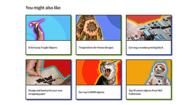
V&A and non-V&A related content
Iteration
The rest of the design process was about understanding how to make the mechanics and transactions of each content type work smoothly, how to make the results rewarding, gauge what worked through more testing, admit what didn't then change and improve it.
User interfaces & way finding devices
Each content type had a different set of colour ways. This included the image borders, checkboxes, buttons, results etc. This created a subtle division and way finding device so that a user would travel the site, most likely by topic and maybe subconsciously be aware that they were travelling to a different place.
-

Different colourways for different content types -
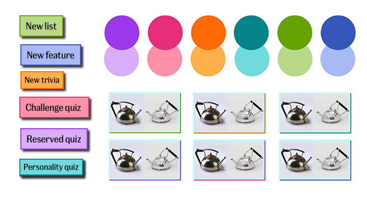
Quiz furniture
User lab #3
By the time we were ready to test for the 3rd time we had a tangible part-built site for our testers to sample. This time we wanted to know if the mechanics of the quizzes were understood. Could they recognise what type of quiz it was? Did they understand the transactional elements and instructions? What did they expect to happen when they finished? Was it rewarding? Did they notice the factoids on trivia quizzes? Were they interesting? How often would they come back if at all? Would they play with friends or on their own?
The wonderful thing about our young testers was their honesty. The best feedback helped us reiterate some of the mechanics and transactions whilst we had the time to get it right. Our user testing concluded that even though they noticed changes in colour, it wasn't very important for them to explicitly know what type of quiz they were doing as they were more driven by the topic and challenges each quiz provided.
The best feedback helped us rethink any sticking points whilst we had the time to get it right.
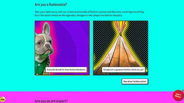
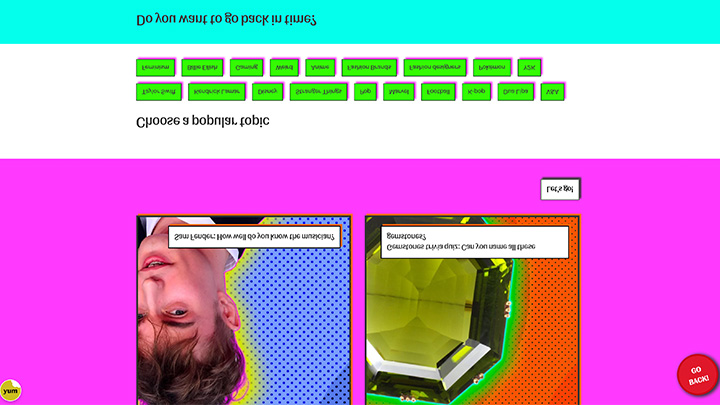
Mischief!!!!
Included in my brand design strategy was to create a bit of subtle mischief as well as a few easter egg animations around the site. We spent time as a team identifying what the benefits might be and where we might place these whilst I looked at pure CSS animation examples as well as the stories and relevance these items bring.
There were defined user end journeys on the site:
- A 404 error page with a rude cat scratch card
- An interstitial page for visitors leaving the site with a waving pokemon character
- A dead search result with a bubble gum blowing dragon. You can burst the bubble on its face. Try it. it's fun
There were also mischievous elements for shits and giggles:
- A "Don't press this button" button, that appeared randomly and would turn the page upside down when pressed
- V&A logos that can be tickled and they will wiggle
- The mused logo animating on page load like it's a naughty giggler.
- Quiz results boxes subtley jumping with joy, nonchalantly shrugging or shaking sideways depending on how well you had done.
All of this added to the sense of fun that we wanted to create.
-
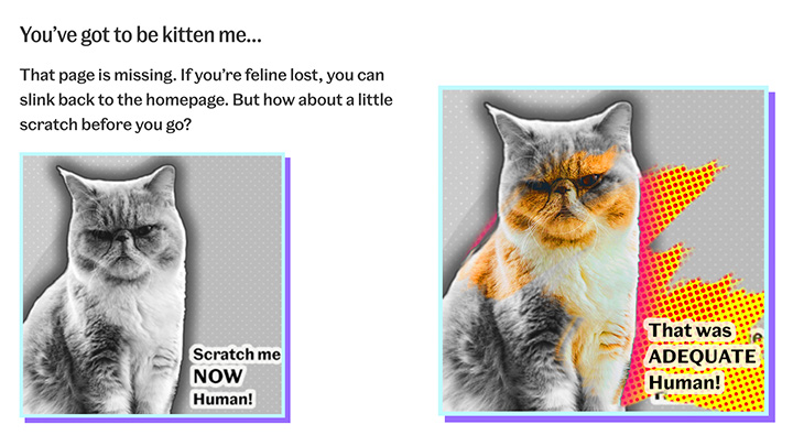
Mischief: Rude cat asking for a scratch -
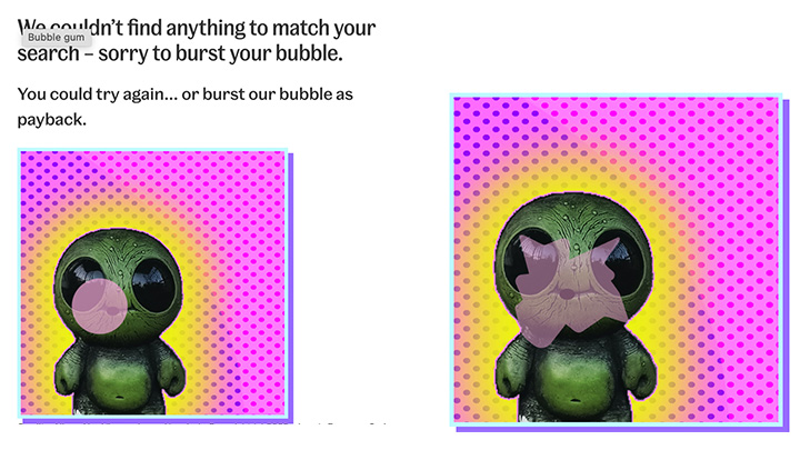
Mischief: Bubble gum blowing dragon
-
Don't press this button!!!! -
Oh no you pressed the button!!!
User lab #4
Now that the majority of the site structure was built we needed to find out if the structure was understood. Could they effectively navigate and travel through the whole site? Did they like or notice any mischief? How did it make them feel? How did the whole site make them feel? Ultimately did they understand: Where they were? What they could do there? What else was relevant nearby?
The final user testing also revolved around the latecomer designs for a Challenge quiz, the type of quiz where a user needs to name as many things in an allotted time. We soon realised that some of our testing group found the timer stressful whilst others really relished the this feature so we made that optional. There are a lot of obstacles to a challenge quiz and most of these are around misspelling answers. We needed to create as much flexibility as we could around the answer functionality.
Ultimately did they understand: Where they were? What they could do there? What else was relevant nearby?
Accessibility & safeguarding
We took the accessibility very seriously throughout the whole project, starting as we meant to go along plus we worked closely with the wonderful Caspian Turner of Accessible by Design to make sure that our entire site worked for all: the nomenclature, the tone of the language was correct as well as the obvious standards like high contrast colour ratios and font sizes and legibility.
There were many site considerations around children's online code, GDPR and COPR. We had a duty of care to our users who were all under age and there were many safeguarding standards that we needed to reach including designing and building an the interstitial page to inform users that they were leaving the safety of the site, being clear and transparent with our messaging on data collection, getting the tone of the content right. We also followed the same rules when interviewing our testers.
Launch and final thoughts
We finally launched in September 2023. I think we achieved most of what we intended. I continued working on some marketing assets for the site (new article to come soon) and I had the opportunity a few months later to revisit the homepage design as I don't think I'd satisfactorily finished it at launch. I also implemented some new navigational changes that the handover team wanted.
One year on, I came to a gathering to see how the site was performing and was happy to find a healthy uptake of visitor numbers and engagement.
Writing this article has made me realise that was a hell of a lot of work but it was a very rewarding experience. I've only mentioned a fraction of it. I got to work with a lovely and talented bunch of people and incorporate a lot of my skills and techniques into one large project. I very much enjoyed getting to know and speaking to our user lab testers over the best part of 9 months. I am so very grateful to have been given the trust and respect to pull that work together.